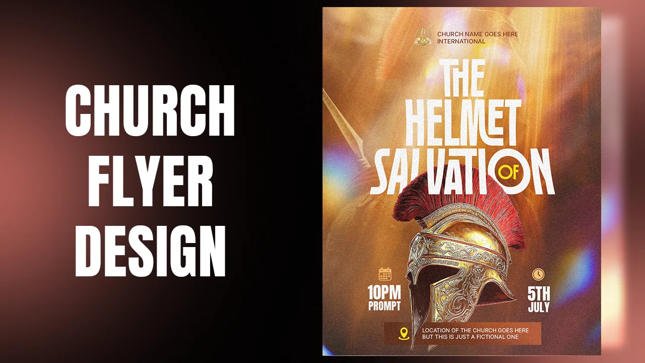
In this tutorial you will design a church event flyer, "When Purpose Dries Up", in Adobe Photoshop. The idea is simple and strong: a ship that belongs on the water, stranded in the middle of a desert. The whole flyer is built from two photos, two fonts and a few adjustment layers.
This is a background lesson first. You will blend a cut-out ship into the sand so it looks like it has always been there, then build a bold type lockup on guides, turn a letter into an arrow, and finish with noise, light and dust. Each step links to the exact moment in the video, so press Watch at whenever you want to see it done.
What you will make

What you need
- Adobe Photoshop (any recent version with Camera Raw Filter)
- The resource pack: desert photo, cut-out ship, light leaks, vintage dust, and the Anton and Moland fonts
- About 25 to 30 minutes
- Install both fonts before you open Photoshop so they appear in the font list
Get the resource pack from our Telegram channel before you start.
Open Photoshop and choose New file. Set the units to Pixels, the width to 1080 and the height to 1350. That is the 4:5 portrait size that fills the screen on Instagram and WhatsApp status.
Set the resolution to 300 pixels per inch, keep RGB Color, and click Create.

Open the resource folder. Drag the desert photo onto the canvas first and press Enter to place it. Then drag in the cut-out ship; it is already a PNG with a transparent background, so it lands on the sand straight away.
Hold Shift and drag a corner to scale the ship down a little, then centre it. Sit its bottom slightly below the horizon line of the dunes so it looks buried rather than floating on top.


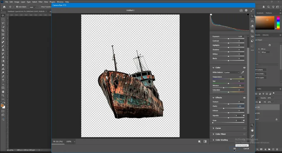
The ship photo was taken over water, so its colors are too cold for a desert. With the ship layer selected, go to Filter › Camera Raw Filter.
- Temperature: +16, to warm it up like the sand.
- Vibrance: −31, to take away the strong blues.
- Clarity: −31, to soften the harsh detail.
Click OK. The ship now looks rusty and dry, which is exactly the story of the flyer.
Tip: Camera Raw on a Smart Object stays editable. Convert the ship to a Smart Object first and you can reopen the filter at any time.

Click the Add layer mask icon at the bottom of the Layers panel. Press B for the brush, right-click on the canvas and choose a Soft Round brush from the General Brushes. Set the foreground color to black.
Lower the brush Flow in the options bar, then paint gently along the bottom of the hull. The hard cut-out edge fades away and the ship sinks into the dune. Use [ and ] to make the brush smaller or bigger.
Take your time here: in the video this part is done quietly, with many small strokes along the whole bottom edge, including the shadow side on the right.
Tip: Low flow with many strokes blends better than one strong stroke. If you go too far, switch to white and paint the hull back.


With the ship selected, open the Adjustment menu at the bottom of the Layers panel and choose Exposure. Right-click the new layer and choose Create Clipping Mask (or click the clip icon in the Properties panel) so it only affects the ship.
Raise the Exposure and lower the Gamma Correction. Then press Ctrl+I to invert the mask to black, which hides the effect.
Take a soft white brush and paint over the side of the ship that faces the sky. Only those parts brighten, so the light looks like it comes from above. If you want more depth, add a second Exposure layer, darken it and paint it into the shadow side.


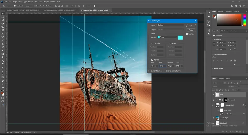
Guides keep the type tidy. Go to View › Guides › New Guide Layout, tick Margin and enter Top 75 px, Left 145 px, Bottom 75 px, Right 145 px.
Open New Guide Layout again. Make sure Clear Existing Guides is unticked, otherwise your first guides disappear. This time set Left 290 px and Top 190 px. These two new lines mark where the title starts.
Tip: If your guides vanish when you add the second layout, you left Clear Existing Guides ticked. Undo with Ctrl+Z and untick it.

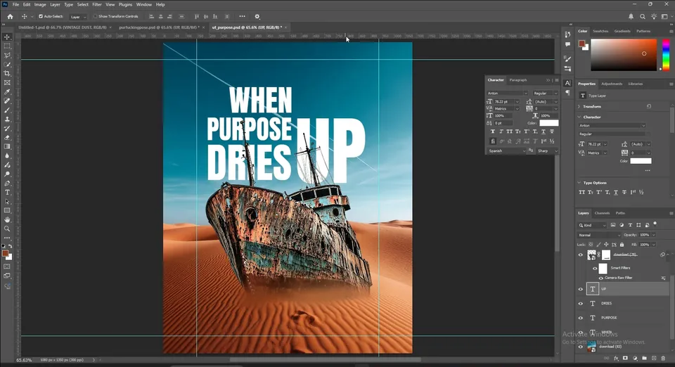
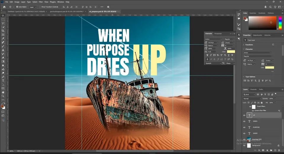
Press T, click inside the guides and type WHEN in capitals. Open Window › Character and choose Anton. Make the text white.
Press Ctrl+T (Free Transform) and scale the word until it touches the top and left guides. In the video it ends at about 31 pt. Then drag a new guide from the ruler to the right edge of the word; this is where the other words will line up.


Duplicate the text layer with Ctrl+J, move it down and change the text to PURPOSE. Scale it so its right edge touches the same guide as WHEN. A longer word becomes shorter in height, which gives the stack its rhythm.
Duplicate again and type DRIES, scaled the same way. Select all three layers and try Distribute vertical centers in the options bar. If the spacing still looks uneven to your eye, adjust it by hand: optical spacing matters more than the numbers.


In the Layers panel, drag the three text layers below the ship layer, but keep them above the desert. Be careful not to drop them inside a group or onto a mask.
Now the masts and ropes of the ship cross in front of the letters, which makes the ship feel big and close.

Click outside the text, duplicate one of the words and type UP. Scale it with Ctrl+T so it is tall enough to reach from the middle of PURPOSE to the bottom of DRIES, and move it to the right of the stack, snapped to the guides.
Double-click the text color and enter #FFF7A1, a soft cream yellow. It stands out from the white words but still feels part of the same lockup.
Duplicate the UP layer with Ctrl+J and hide the original as a backup. Right-click the copy and choose Convert to Shape.
Press A for the Direct Selection tool (right-click the tool if the Path Selection tool is active). Click the top-left point of the U, hold Shift and click the top-right point, then release.
Click one of the selected points again, hold Shift and drag upwards. The two points move together and the left arm of the U becomes a long shaft.
Tip: Keep the hidden UP text layer. If the shape goes wrong you can duplicate the text again instead of starting over.


Right-click the shape tools and pick the Triangle tool. If your version does not have it, pick the Polygon tool and set Sides to 3 in the options bar (or click once on the canvas to type it in).
Drag out a triangle with the same yellow and place it on top of the shaft. Press Ctrl+R to show the rulers and drag a guide to check that the triangle sits centred on the shaft. Now UP reads as a rising arrow.


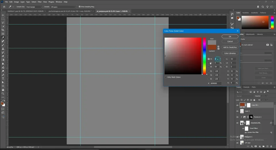
Select the top layer. Add a Solid Color adjustment and set it to H 0, S 0, B 50, a neutral grey.
Go to Filter › Noise › Add Noise and click Convert to Smart Object when asked, so you can edit the filter later. Tick Monochromatic, choose Gaussian, and set the amount to about 20.
Change the layer's blend mode to Soft Light for a subtle grain, or Hard Light with a lower opacity for a rougher, printed look.
Tip: Too much noise kills the clean look. If you want a crisp flyer, skip the noise or keep it on Soft Light at a low opacity.


Drag the light leaks image from the resource folder on top, set its blend mode to Screen and hide it for now.
Create a new layer under it and set the blend mode to Linear Dodge (Add). Take a big soft brush at 100% flow, pick #036581 and click once or twice at the top right: the sky starts to glow. Then pick #B87348 and dab once over the sand for a warm sunlit area. One click is often enough.
Finally bring in the vintage dust image, set it to Screen, Linear Dodge or Color Dodge, and turn the light leaks back on if you like the color streaks.


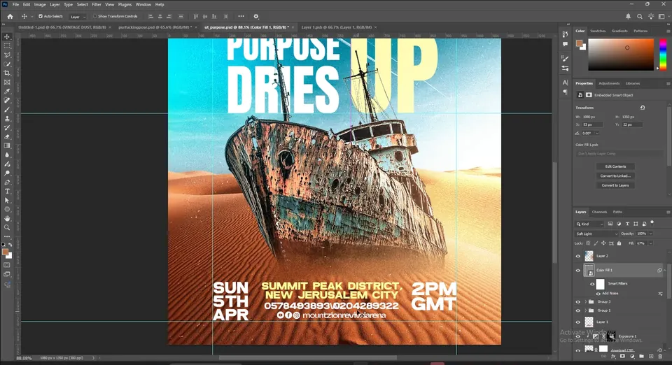
The church logo and name go in the top left corner and the edition (APRIL EDITION) in the top right, inside the margin guides.
At the bottom, build a three-column footer in the Moland font: the date on the left (SUN 5TH APR), the venue and phone numbers in the middle, with the venue in the same cream yellow as UP, and the time on the right (2PM GMT). Add small social icons with the handle under the numbers.
In the video the footer and logo are dropped in from an earlier flyer, so it happens fast. Build each column as its own text layer and put each group in a folder so you can reuse it next time.
Key takeaways
- A strong flyer idea can come from one surprising photo: a ship stranded in a desert tells the theme before anyone reads it.
- Camera Raw (temperature, vibrance, clarity) and a soft mask make a cut-out sit naturally in a new background.
- Clip an Exposure layer to the subject and paint the highlights in where the light should hit.
- Build type on guides, scale each word to the same width, and trust your eye for the final spacing.
- Convert text to a shape to turn a letter into an arrow, then finish with noise, a Linear Dodge glow and dust.