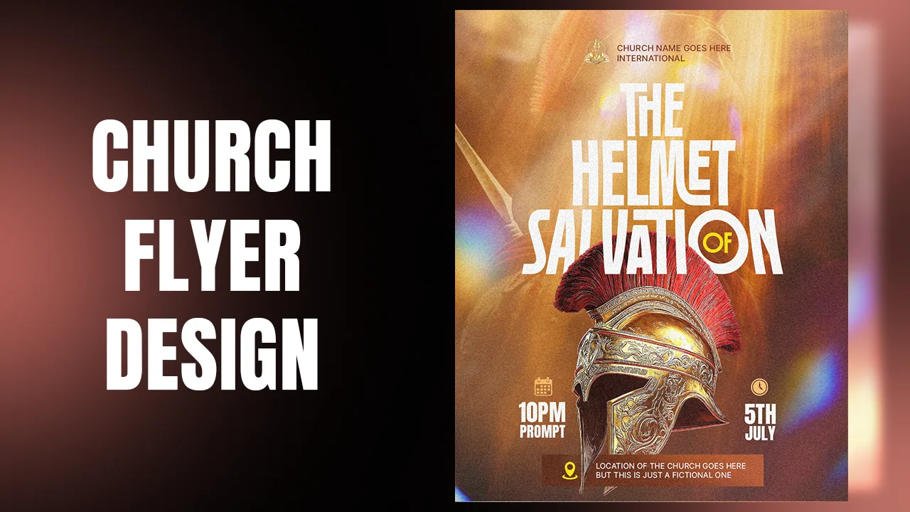
In this tutorial you will design a church flyer, "Sunday Prayer Service", in Adobe Photoshop using just one photo. A young woman sings in worship in front of a soft, blurred crowd, with a tall warped title rising behind her.
This is a method you can reuse with almost any good photo you find: cut out the main person, turn the same photo into a blurred background, put a big title behind the person, then finish with a warp, a gradient, a black and white effect, a light leak and noise. Each step links to the exact moment in the video, so press Watch at whenever you want to see it done.
What you will make

What you need
- Adobe Photoshop
- The resource pack: the worship photo, the cut-out of the woman, the light leak and the icons
- The Robinco font
- About 15 minutes
Get the resource pack from our Telegram channel before you start.
Open Photoshop and create a new document of 1080 × 1350 px, then click Create. This portrait size fits Instagram, Facebook and WhatsApp status without cropping.

The whole flyer comes from one image. When you see a strong photo, for example on Pinterest, do not skip it: it can become a clean church flyer for a Sunday service or a prayer night. The resource pack has this worship photo and a few others to practise with.
The important job is to cut out the main subject, here the woman singing. You can remove the background for free with a tool like Photoroom. The cut-out is already in the resources for you.
Tip: Look for photos with one clear person and a busy crowd behind. They make the best single-image flyers.

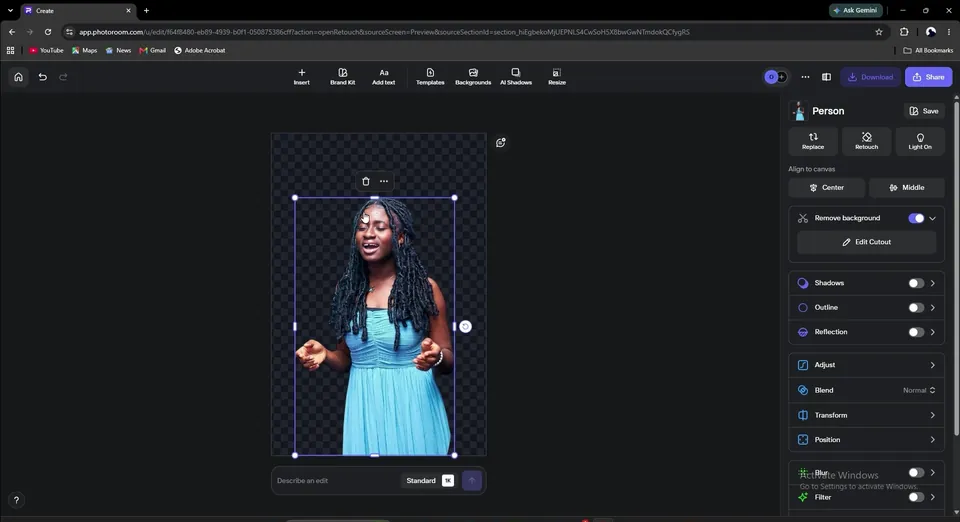
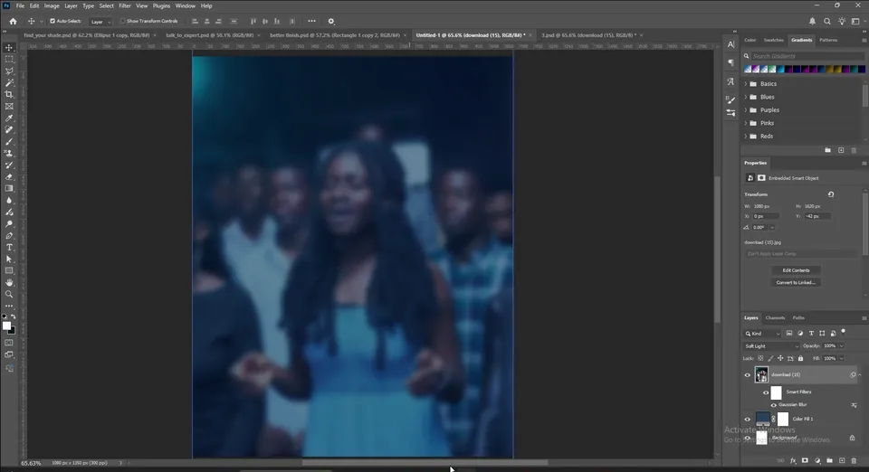
In Photoshop, add a Solid Color fill layer. Choose a colour that matches the mood of the photo. This one is full of cyan and navy blues, so use #28415e.

Drag the full photo (with its background) onto the canvas and let it fill the page. Zoom out and move it down a little.
Set its blend mode to Soft Light so it mixes with the navy. Then go to Filter › Blur › Gaussian Blur and set the radius to about 10 px (9 is fine too). The crowd becomes a soft blue background and the photo is no longer competing with the text.
Tip: Soft Light keeps the colours of the Solid Color underneath, so the background always matches the mood you picked.

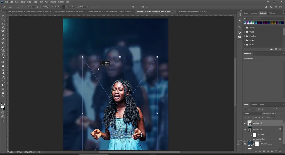
Drag in the cut-out of the woman. On top of the blurred version she looks sharp and vibrant straight away.
Scale her down and move her lower on the page, so there is room above her head for the title.
Create a new layer and pick the Gradient tool. In the gradient presets, open Basics and click the middle one, Foreground to Transparent. Make sure the foreground colour is black.
Hold Shift and drag a short line upwards from the bottom of the page. Do not drag so far that the shadow covers her face: you only want a little darkness at the bottom.
Tip: Holding Shift keeps the gradient perfectly straight.


The title goes behind the woman, so first select the layer just under her. Then type SUNDAY, PRAYER and SERVICE on three lines, pressing Enter after each word.
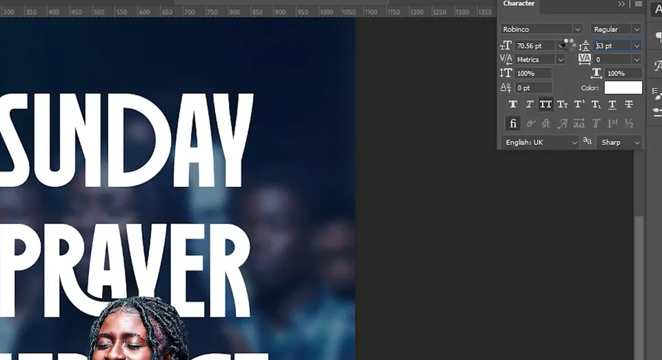
Open the Character panel from Window › Character and set the font to Robinco (it is in the resources) in white. Scale the text up so it fills the space above her head.


If the leading in the Character panel is set to Auto, you get big gaps between the lines. Click the leading value and change it until the lines sit close together.
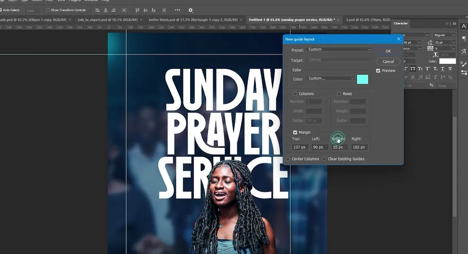
Go to View › Guides › New Guide Layout. Untick Columns if it is on, tick Margin and set the top, left, bottom and right values. Line up the left and right guides with the sides of the title.
You can also show the rulers with Ctrl+R and drag guides out by hand.
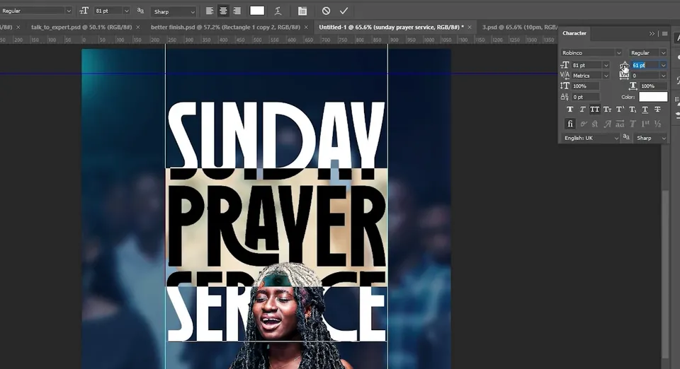
For a solid block of text, make each word fill the width between the guides. Open the leading up for a moment to give yourself room, then select PRAYER with the Type tool and increase its font size until it reaches both guides. Do the same for SUNDAY.
Now close the leading again line by line: select SERVICE and reduce its leading to move it up, then select PRAYER and reduce its leading to pull the lower lines up.
Tip: Changing the leading of just one line moves only that line, which makes it easy to tidy the block.

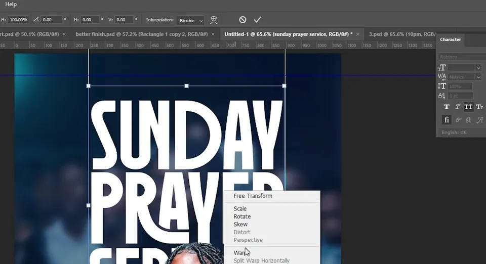
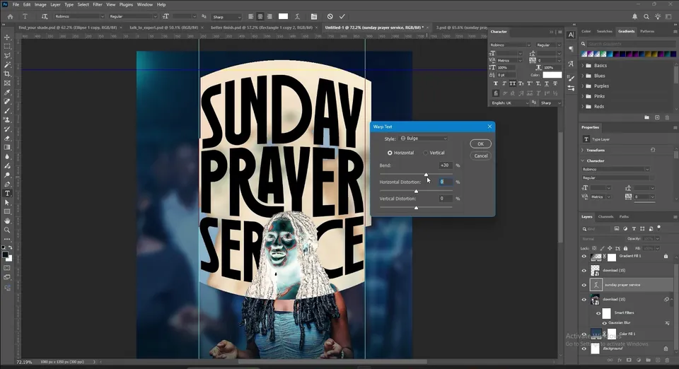
Press Ctrl+T, right-click and choose Warp, or right-click the type layer and choose Warp Text. Try a few styles: Arc Lower and Flag both give interesting shapes.
In the video the final choice is Bulge. Set Horizontal Distortion and Vertical Distortion to 0 and the Bend to about +30%. The title swells out like a banner behind her. To change it later, double-click the layer, choose the Type tool and click the Warp Text icon in the options bar.
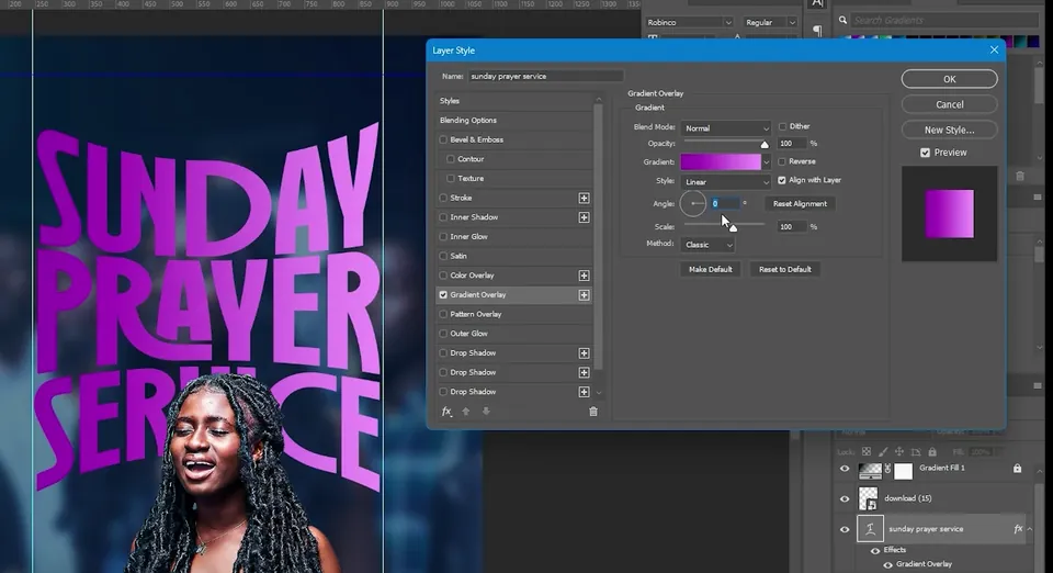
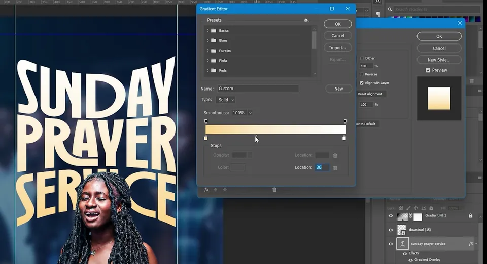
Click fx › Blending Options on the title layer and choose Gradient Overlay. Set the Angle to 90° so it runs from top to bottom.
Click the gradient, choose the first preset under Basics, keep white on one stop and change the other to a warm orange cream. Drag the white stop in a little, raise the saturation slightly and click OK. The title fades from white at the top to warm cream at the bottom.
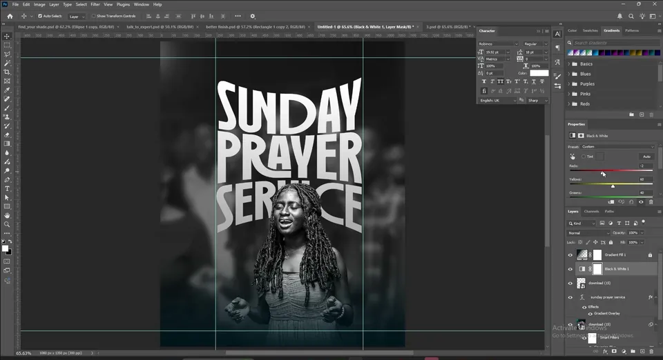
Select the cut-out and add a Black & White adjustment from the Adjustments panel. You can play with the sliders, but the default is fine.
Right-click the adjustment and choose Create Clipping Mask, so only the woman turns black and white. The background stays blue and the warm title now stands out even more.
Tip: Without the clipping mask, the Black & White adjustment would turn the whole flyer grey.
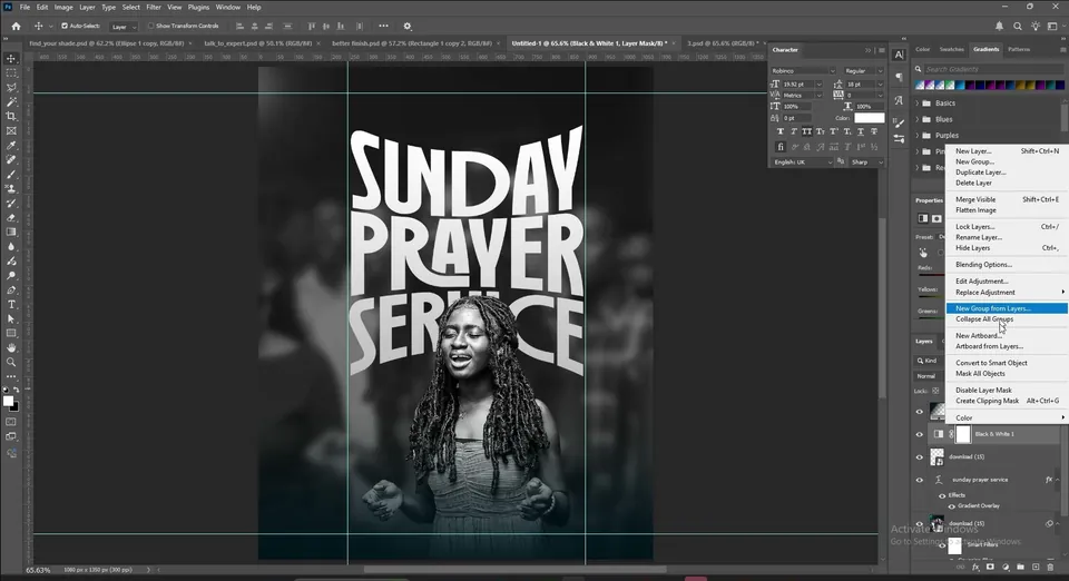
Bring the light leak from the resource folder onto the top of the layer stack and scale it to fill the canvas.
Set its blend mode to Screen so the black disappears and only the rainbow streaks stay on the edges.
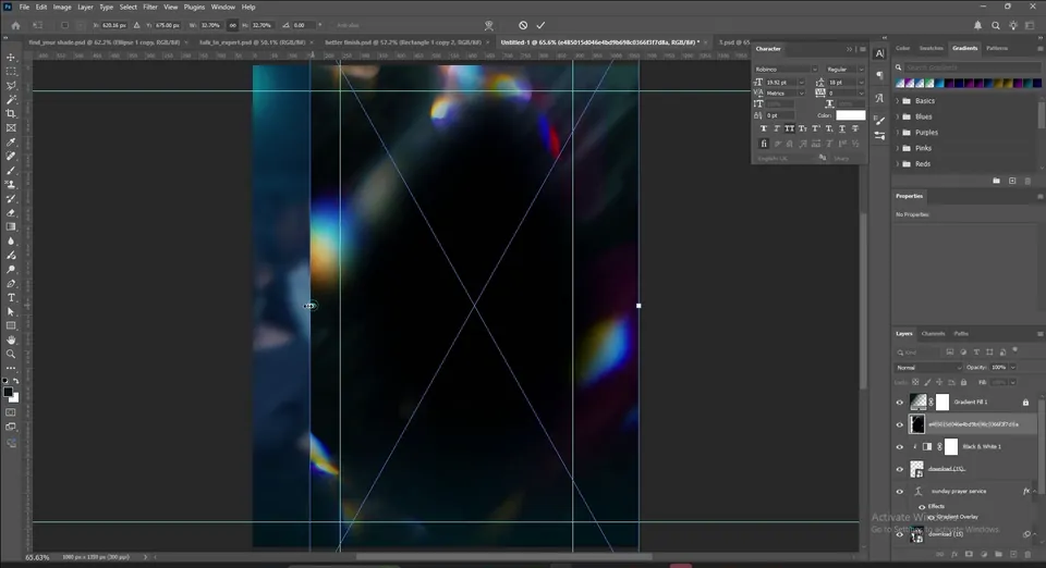

Add a Solid Color fill layer with the Saturation at 0 and the Brightness at 50 (the hue does not matter). Go to Filter › Noise › Add Noise, click Convert to Smart Object if asked, choose Gaussian, tick Monochromatic and click OK.
Set the blend mode to Hard Light or Soft Light and lower the Fill until the grain feels subtle.


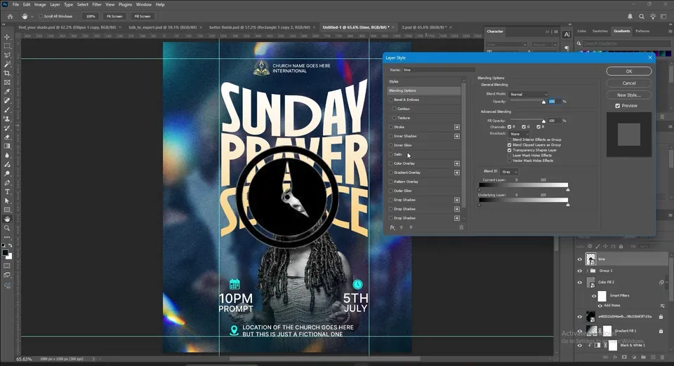
Finish with the details: the church logo and name at the top, 10PM PROMPT on the left and 5TH JULY on the right, and the location at the bottom. The calendar, clock and location icons are in the resources.
To recolour an icon, go to fx › Blending Options › Color Overlay and pick a colour, such as the bright cyan used here.
Key takeaways
- One good photo is enough: use the cut-out for the subject and the full photo, blurred, for the background.
- Blend the blurred photo on Soft Light over a matching Solid Color.
- Place the title between the background and the cut-out, so the person stands in front of it.
- A Bulge warp and a white to cream Gradient Overlay turn plain type into a feature.
- Clip a Black & White adjustment to the subject, then finish with a light leak on Screen and noise.