In this tutorial you will design a clean eagle logo and wordmark, "Strato Bank", in VectorCraft, the free vector app from the ArtCraft suite. If you know Adobe Illustrator, you will feel at home: the pen tool, shape builder, gradients and the character panel all work in a very similar way.
The method is the one professionals use for any logo: place a reference, lower its opacity, trace it with clean shapes, merge the shapes with the shape builder, then add color and type. Each step links to the exact moment in the video, so press Watch at whenever you want to see it done.
What you will make

What you need
- VectorCraft, installed from the free ArtCraft launcher
- The reference logo image from the resource pack
- About 20 to 30 minutes
- A mouse is enough. The pen tool is easier with practice, not with special hardware.
Get the reference image from our Telegram channel before you start.
Open the ArtCraft launcher. If you followed the PhotoCraft video you already have it. The launcher lists every app in the suite: PhotoCraft, VectorCraft, FilmCraft, LightCraft and more, and it shows when updates are available.
Click Install under VectorCraft, and when it finishes, click Open.

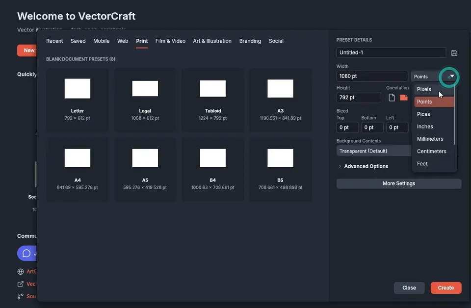
On the welcome screen, click New file and open the Print tab. Change the units from points to Pixels, then set the width and height to 1080 × 1080 px. A square artboard is a good base for a logo because it matches social profile images.
Keep one artboard, ignore the bleed settings for now, and click Create.
Before drawing, take a quick look around. The tools are on the left, as in Illustrator. Right-click a tool to see the hidden ones in its group: the line tool, the polar grid and the flare tool, for example.
On the right, the Properties panel controls fill, stroke, transform and opacity, and the Layers panel lists everything on the artboard. At the bottom of the toolbar you can swap or remove the fill and the stroke.
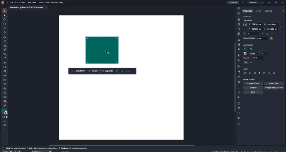
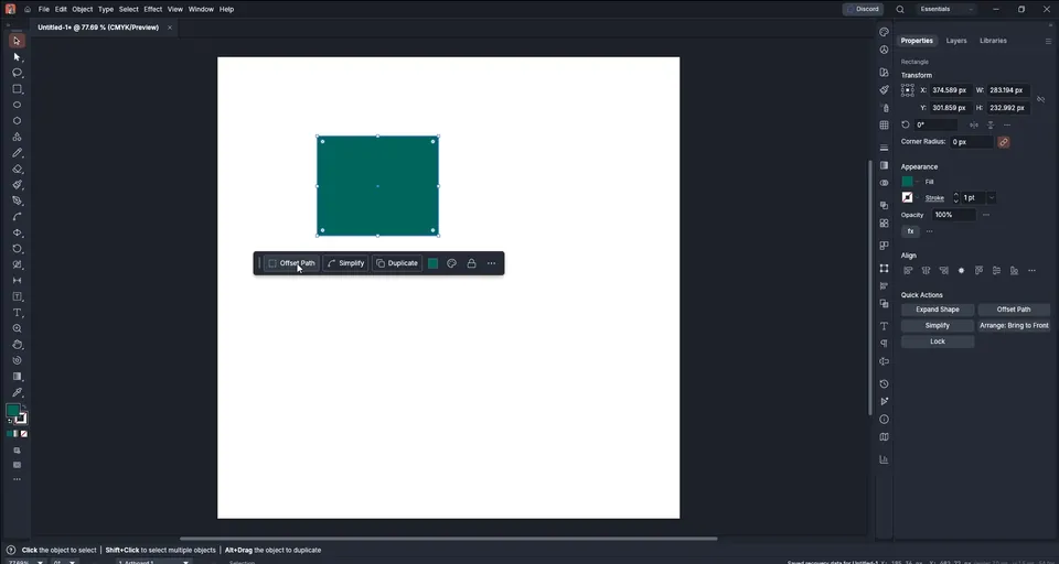
When you select a shape, a small quick toolbar appears under it with Offset Path, Simplify, Recolor Artwork and Duplicate. Offset Path works exactly like Illustrator's: try 10 px on a rectangle to see the outline grow.
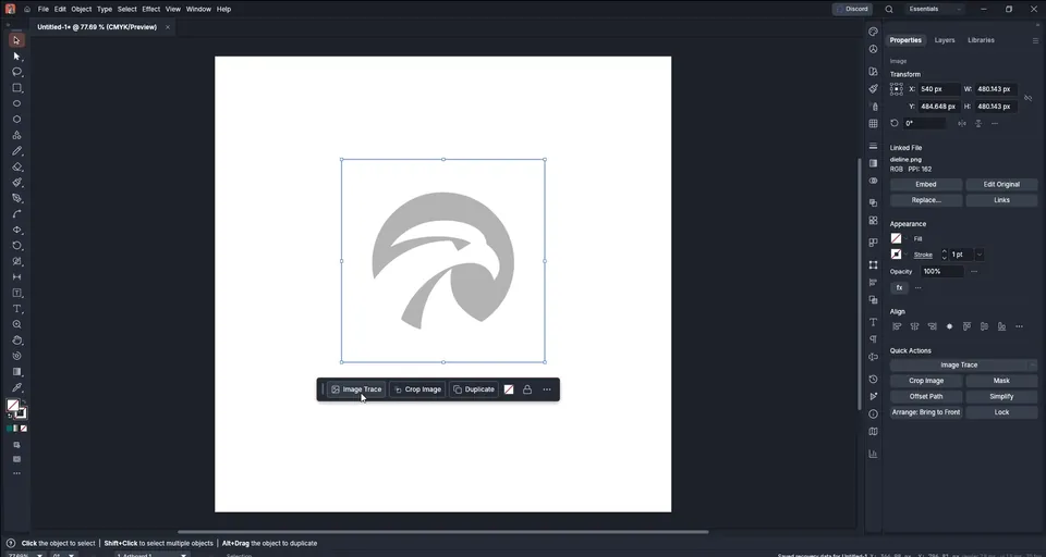
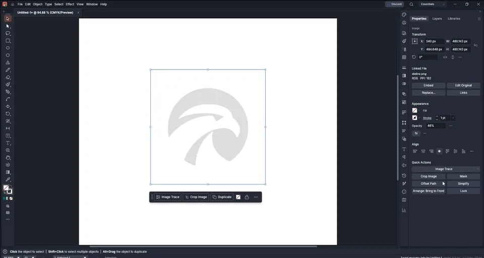
Drag the reference image from the resource folder onto the artboard. Hold Shift while you scale it so it keeps its proportions.
The quick toolbar now shows Image Trace. Click it and the image becomes vector shapes in one step; pick a fill color from the swatches and you have an editable logo. It is one of the best tools in the app, and it works well when your sketch is already clean.
A hand-drawn sketch is never that clean, so in this tutorial we will not trace automatically. We will rebuild the logo by hand with clean curves, which always gives a better result.
Tip: Image Trace is great for clean, high-contrast artwork. For sketches and photos, trace by hand: you get fewer points and smoother curves.

Select the reference and lower its Opacity in the Properties panel (it is under Transparency) until the logo is a light grey. This lets you see your own lines clearly on top.
Then lock it so you do not move it by accident: click the padlock next to the eye icon in the Layers panel, or use Object › Lock Selection.
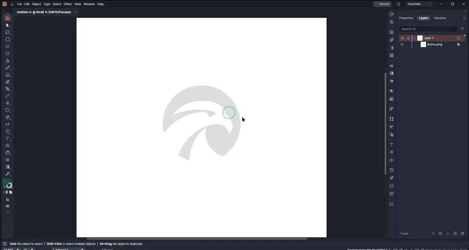
Zoom in. Holding Alt while you scroll zooms, and holding Space lets you drag the view around.
Pick the Ellipse tool and drag while holding Shift to draw a perfect circle over the round outline of the logo. Swap the fill to a stroke with Shift+X, or click the swap arrow at the bottom of the toolbar, and make the stroke black so you can see it over the grey reference.

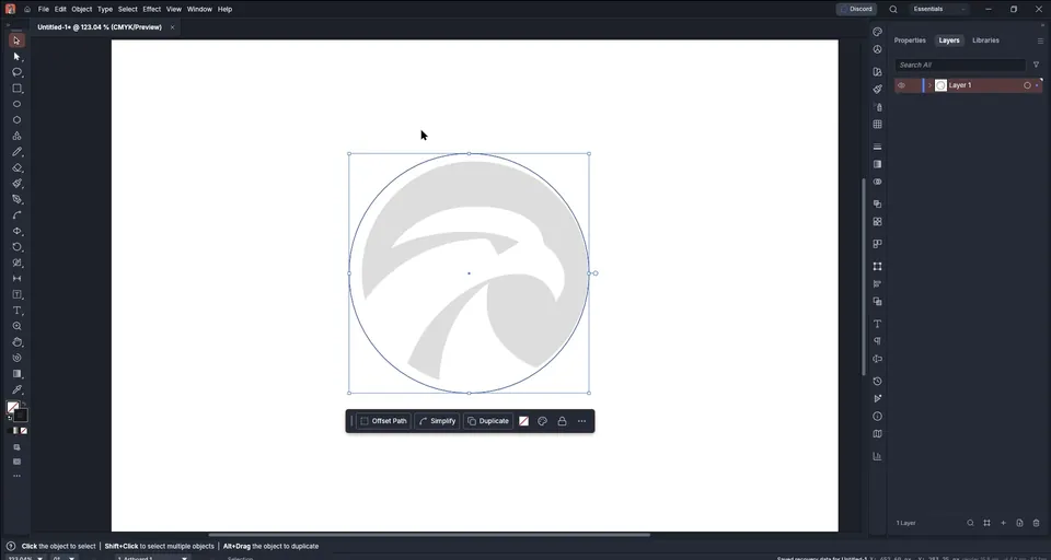
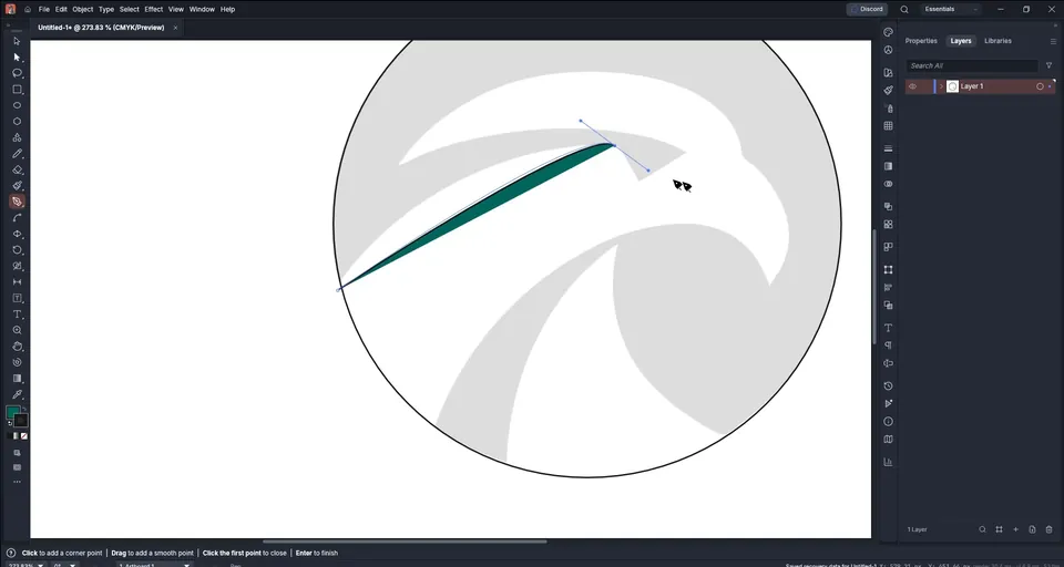
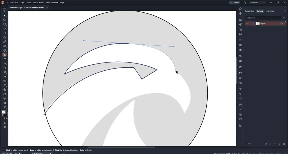
Press P to select the Pen tool. Remove the fill first, so the shape you draw does not cover the reference: click the fill swatch and choose none.
Now trace each part of the eagle:
- Click to add a corner point.
- Click and drag to pull out handles and make a curve.
- Click the point you just made to cut its forward handle, so the next segment can change direction sharply.
If a curve does not sit right, place a point in the middle of it and drag. Work segment by segment rather than trying to get the whole curve in one move. When a shape is finished, press Esc and start the next one.
The lines do not have to stop exactly at the circle. Let them cross it; the shape builder will clean them up in the next step.
Tip: Fewer points make smoother curves. If a curve looks lumpy, delete a point instead of adding another one.
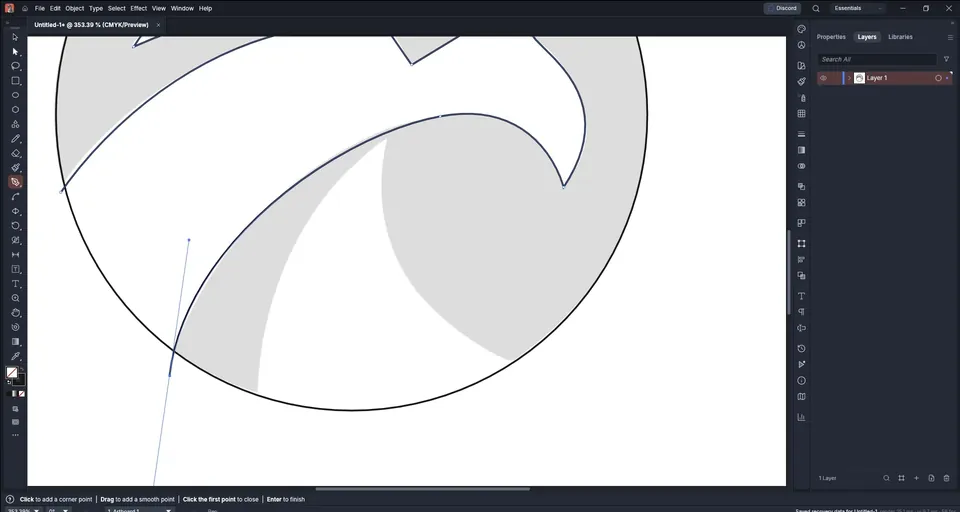
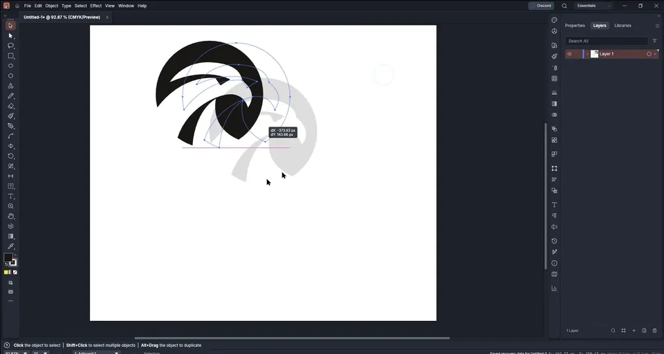
Switch to the Move tool and select all your lines and the circle. Then pick the Shape Builder with Shift+M. Hover over the artwork and each area that can become a shape lights up.
- To remove an area or a stray line, hold Alt (the cursor shows a minus) and drag through it. Do this for the eye and the inner cut-outs.
- To keep an area, click on it without holding any key, or drag across several areas to join them into one shape.
When the highlight covers the whole eagle as one area, it has become a single shape.
Tip: If clicking does not select a line, click directly on its stroke. Shapes without a fill can only be selected by their outline.
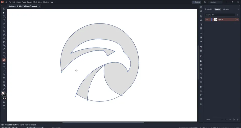
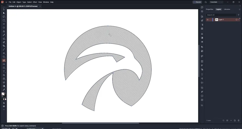
The shape builder sometimes leaves a duplicate shape on top. Select the shape, move it to the side, and delete any leftover lines that are not part of the logo.
In the Layers panel, hide the reference image. Fill the mark with black (Shift+X swaps the stroke back to a fill) and look at it on its own. This is the moment to judge the shape: does it read clearly as an eagle?
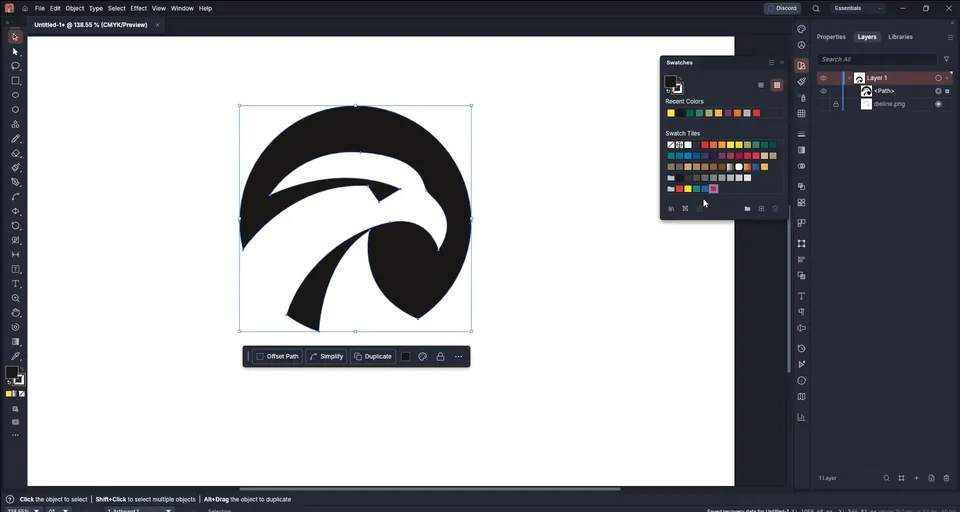
Open Window › Swatches and click any color, or double-click the fill swatch and type a hex code for an exact brand color.
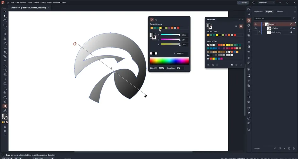
For a gradient, press G to select the Gradient tool and drag across the logo. Drag the end points to change the direction, and double-click each stop to choose its color. The final logo uses a blue gradient, but a solid blue works just as well. Choose whichever fits the brand.

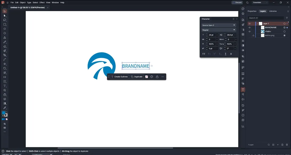
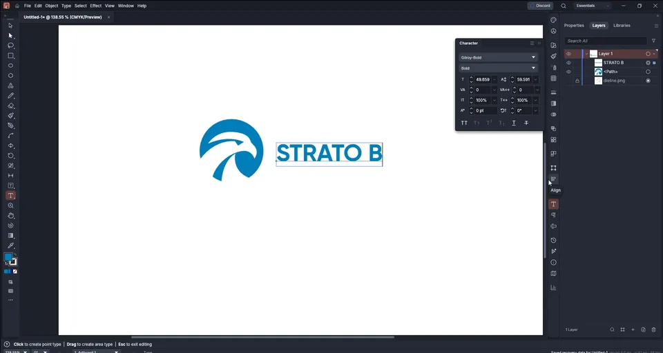
Scale the mark down and press T for the Type tool. Click next to the mark and type the name. Here it is "Strato Bank".
Press Ctrl+T to open the Character panel. Change the font (the video uses Gilroy Bold), the size and the letter spacing there. Set the text in capitals so its height lines up neatly with the mark.
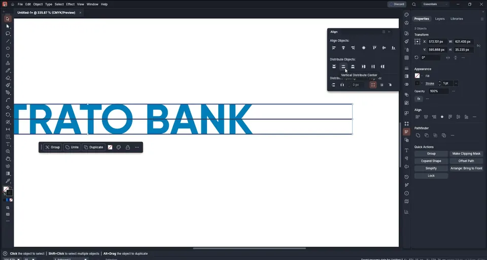
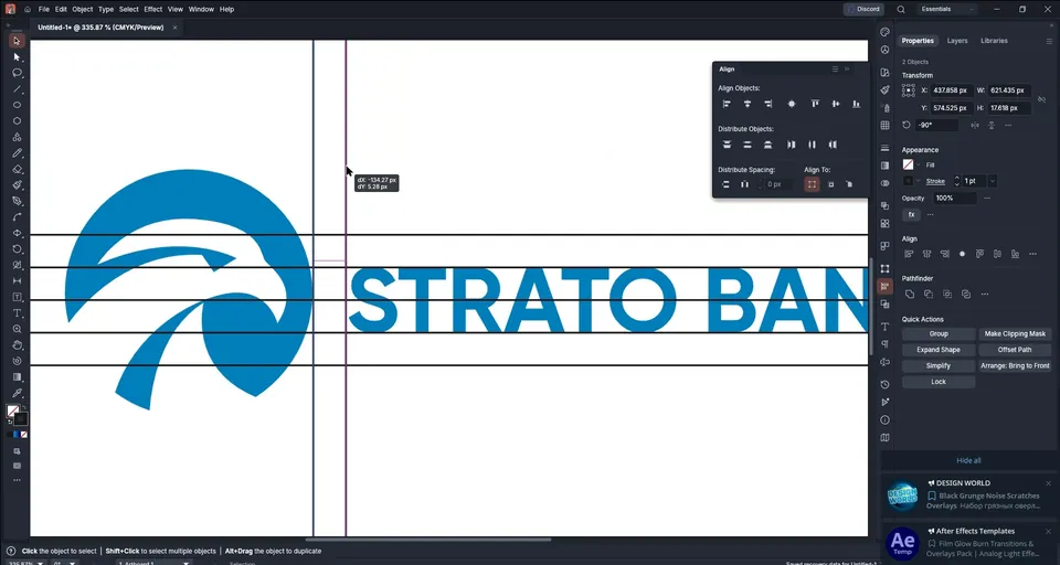
Good logos line up exactly. Use the Line tool (right-click the shape tools to find it) to draw thin 1 px guide lines across the top, middle and bottom of the text.
Open Window › Align, select the lines and use Distribute vertical centers so they are evenly spaced. Then scale the mark so its top and bottom touch the same lines as the capitals. Delete the guide lines when you are done.
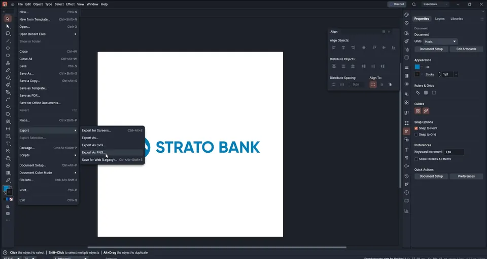
Go to File › Export. You can export as SVG, PNG, JPEG or PDF. For a quick image, choose Export as PNG.
Tick Use artboards if you want the full 1080 × 1080 square; leave it off to export only the logo. In the PNG options, use 72 PPI for screens or 300 PPI for print, and choose a transparent background so the logo sits on any color.
Tip: Export an SVG as well as the PNG. The SVG stays sharp at any size and is what printers and web developers will ask for.

Key takeaways
- VectorCraft works very much like Illustrator: pen tool, shape builder (Shift+M), gradient tool (G) and character panel (Ctrl+T).
- Place a reference, lower its opacity and lock it before you trace.
- Trace with simple curves and let lines overlap; the shape builder turns them into one clean shape.
- Judge the mark in solid black before adding color or gradients.
- Line the mark up with the capitals of the name, and export a transparent PNG plus an SVG.