
Visual Hierarchy and the Rule of Thirds
Learn how the eye moves across a design, how the rule of thirds and reading patterns shape layout, and how to place your focal point.

7 min read
A viewer decides in a fraction of a second whether a design is worth attention, and then their eyes begin to move. Where do they land first? Where do they go next? Visual hierarchy is the practice of answering those questions on purpose. This guide explains how people scan a design, how the rule of thirds gives you strong positions for your focal point, and how to combine them to guide the eye through any layout.
Key takeaways
- Every design needs one clear focal point, and the viewer should find it without effort.
- Size, contrast, color, position, space and direction are the six levers of hierarchy.
- The rule of thirds divides a layout into a 3 by 3 grid. Placing key elements on its lines or intersections feels natural.
- People scan in predictable patterns, such as Z and F, so place important items along those paths.
What is visual hierarchy?
Visual hierarchy is the order in which the eye notices elements. We covered the text side of this in type hierarchy. The same logic applies to images, shapes, icons and buttons. If everything in a layout has the same size, color and weight, the eye has no starting point and no path, and viewers leave.
Six tools for building hierarchy
- Size: large elements dominate small ones.
- Contrast: a dark shape on a light background is noticed before a similar-toned one.
- Color: one saturated accent in a muted layout acts like a spotlight.
- Position: the top and center of a layout are usually seen first.
- Space: an element with a lot of space around it stands out. See white space.
- Direction: lines, arrows, hands and a person's gaze lead the eye. In a photo where someone looks toward the text, viewers tend to look there too.
Use two or three of these at once on the focal point, and keep the rest quieter. Layering too many levers on every element cancels them out.
The rule of thirds
Imagine your layout cut into three equal columns and three equal rows. The four points where the lines cross are natural places to put your subject. Compositions that are perfectly centered can feel static. Moving the subject to a third often feels more dynamic and balanced.
How to use it
- Photography and images: put the eyes of a portrait on the upper third line and the horizon on the lower or upper third.
- Posters and covers: place the main image or headline on a third rather than dead center, and fill the other two thirds with supporting space or text.
- Social media posts: use the grid overlay that most phone cameras and editing apps offer.
- Cropping: when cropping a photo, move the subject toward a third before accepting the crop.
The rule of thirds is a guideline, not a law. Centered, symmetrical compositions are perfectly valid, especially for logos, formal documents and emblem-style designs. Choose them on purpose.
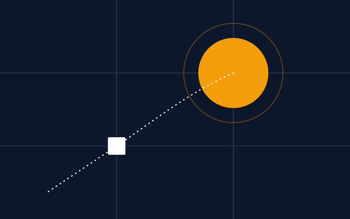
Try it yourself. Drag the subject around the frame and notice how the image feels when it sits in the centre compared with one of the intersections.
Interactive rule of thirds: drag the subject onto one of the four power points.
Leading lines and gaze direction
People instinctively follow where others are looking. If a model in a photo looks toward your headline, viewers tend to look there too. If the model looks away, out of the frame, viewers' eyes may drift off the design.
Other leading lines work the same way: a road disappearing into the distance, an arm pointing, the edge of a table or a row of products. When choosing or cropping photos, notice where these lines point. Place your headline or call to action at the end of the line, or flip the image horizontally if that is possible without making text or logos read backwards.
How people scan a layout
The Z pattern
In simple layouts with little text, the eye often travels from top left to top right, down diagonally to the bottom left, then across to the bottom right. Place your logo at the start, your main message along the diagonal and your call to action at the end.
The F pattern
On text-heavy pages, readers scan across the top, then partway across a second line, then down the left side. This is why headings, bold first words and left-aligned text help scanning. Put key points at the start of lines and paragraphs.
These patterns come from reading direction in left-to-right languages. For right-to-left languages, the patterns mirror.
Worked example: a product advert
Here is how the six tools combine in a simple advert for a fictional summer drink. The goal is for viewers to see the product, understand the benefit and tap the button.
- The photo is the largest element and is placed on the left third, so it is noticed first.
- The headline is large, dark and placed at the top of the right side, so it is read next.
- The supporting line is small and gray. It is there for people who want more detail, and it does not compete.
- The button uses the only warm color in the layout and has space around it, so it stands out as the final step.
- The delivery note is the smallest element on purpose: useful, but not essential to the decision.
If you added a second orange element, such as a large discount badge, it would compete with the button. Every new element must earn its place in the hierarchy.
A quick hierarchy audit
- Print the design or view it at a small size.
- Squint or blur it. What stands out first? Second? Third?
- Write the order you want. If the order differs, adjust size, contrast or position of the elements that are in the wrong place.
- Remove one element that does not support the main message.
- Ask someone who has never seen the design what they think it is about after three seconds.
The rule of thirds and the golden ratio
You may also see the golden ratio (about 1 to 1.618) recommended for layouts and logos. It divides space into slightly unequal parts and produces positions close to, but not exactly on, the thirds lines. Some designers enjoy using it as a construction guide. In practice, the rule of thirds is simpler and gives a very similar result for most posters, photos and social posts. Neither is a guarantee of good design. They are tools for avoiding a static, dead-center arrangement when you do not want one.
Common mistakes
- Two or three elements competing for the focal point.
- Placing the call to action in the least visible corner.
- Using a decorative element that is louder than the message.
- Centering everything out of habit.
To place elements neatly once you know where the eye should go, continue with alignment, balance and proximity.
Frequently asked questions
What is the difference between visual hierarchy and type hierarchy?
Type hierarchy deals with text: headings, subheadings and body copy. Visual hierarchy covers the whole layout, including images, shapes, buttons and space. Type hierarchy is one part of visual hierarchy.
Should the logo be the most important element?
Usually not. On most adverts and posters, the message or offer should be noticed first, and the logo confirms who it is from. Exceptions include brand awareness campaigns and products where the brand name is the main selling point.
Does the rule of thirds apply to social media posts?
Yes. Most phone cameras and editing apps can show a thirds grid. Placing a person's face or a product on one of the intersections usually feels more dynamic than centering it.
How many focal points can a design have?
One main focal point, with one or two secondary points at most. If several elements compete for first place, viewers do not know where to look and often move on.


