Alignment, Balance and Proximity
A checklist-style guide to alignment, balance and proximity, the layout fundamentals that separate tidy designs from messy ones.

7 min read

Ask a professional designer why a layout works and they will often mention three invisible things: things line up, the weight is distributed, and related items sit together. These are the principles of alignment, balance and proximity. They are easy to understand, easy to check and responsible for most of the difference between a tidy design and a messy one. This guide covers each with a checklist you can apply to any project.
Key takeaways
- Alignment: every element should connect to something else along an invisible line.
- Balance: the visual weight of a layout should feel stable, whether symmetrical or not.
- Proximity: related things belong close together, and unrelated things need space between them.
- These three principles work without any special tools. Guides, grids and a ruler are enough.
Alignment
Alignment means placing elements so their edges or centers share a common line. When a headline, a paragraph and a button all start on the same left edge, the eye sees one organized column. When each is shifted a few pixels, the design looks accidental, even if viewers cannot say why.
Alignment guidelines
- Choose a main alignment (usually left) and hold it. Left-aligned text is the easiest to read for left-to-right languages.
- Avoid mixing center and left alignment in the same text block. If you center a heading, center its supporting line too.
- Use guides or a grid to snap edges. See grid systems.
- Justified text (both edges straight) can create large gaps between words in narrow columns. Use it only with wide columns and hyphenation.
- Align by optical edge. Circles and triangles need to extend slightly past straight edges to look aligned.
Balance
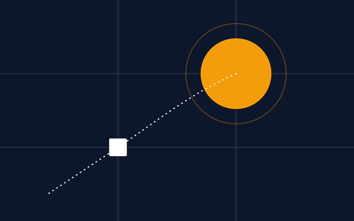
Every element has visual weight. Large, dark, saturated or complex elements feel heavy, while small, light and simple ones feel light. Balance is the feeling that the weights are distributed in a way that does not tip the page over.
Types of balance
- Symmetrical: the left and right sides mirror each other. It feels formal, stable and traditional, and suits certificates, invitations and institutional brands.
- Asymmetrical: different elements balance each other by weight. A large photo on the left can be balanced by a small block of bold text on the right. It feels modern and dynamic.
- Radial: elements radiate from a center point, as in a badge or emblem.
To test balance, squint or blur the design and check whether one area feels much heavier than the rest. If it does, add weight to the light side, remove it from the heavy side, or move elements closer to the center.
Proximity
Proximity says that things placed close together are perceived as related. It is one of the most powerful grouping tools because it needs no lines or boxes, only space.
Using proximity
- Group by meaning. A heading belongs with its text, not floating in the middle between two sections.
- Use more space between groups than inside them. A good starting ratio is roughly double.
- Keep captions near their images and labels near their fields.
- Replace borders and boxes with space whenever possible. It looks cleaner and reduces visual noise.
Related principles: similarity, continuity and closure
Alignment, balance and proximity belong to a larger family of ideas called the Gestalt principles. They describe how people naturally group and complete what they see. Three more are especially useful in everyday design.
- Similarity: items that share a color, shape or style are seen as related. Use the same style for all buttons, all captions or all icons in a set, so viewers understand they do the same job.
- Continuity: the eye prefers to follow smooth lines and curves. Arranging elements along a line or arc leads the viewer through a sequence, which is useful in timelines and step-by-step graphics.
- Closure: the mind fills in missing parts to see a complete shape. Many logos use this to create memorable marks with fewer lines.
Optical alignment: when the math is wrong
Sometimes things that are aligned perfectly by the numbers look wrong to the eye. Round and pointed shapes are the classic example.
A circle that is exactly the same height as a square looks smaller, because it touches the top and bottom lines at only one point each. Type designers solve this by letting round letters like O and C extend a little above and below straight letters, which is called overshoot. Apply the same idea in your layouts: nudge icons, play buttons and rounded logos until they look aligned, even if the numbers say they are a pixel or two off. Trust the eye for the final adjustment.
Putting it together: a three-minute checklist
| Check | Question to ask | Fix |
|---|---|---|
| Alignment | Can I draw straight lines along the edges of elements? | Snap items to guides or one left edge |
| Balance | Does one corner or side feel heavier than the rest? | Resize, recolor or shift elements |
| Proximity | Can I tell which items belong together without reading? | Reduce gaps inside groups, increase gaps between groups |
| Consistency | Are spacings repeated? | Use a spacing scale such as 8, 16, 24, 32 |
Repetition: the principle that ties it together
Many design teachers add repetition and contrast to the three principles in this guide, so the full set is often remembered as contrast, repetition, alignment and proximity. Repetition means reusing the same fonts, colors, spacing, shapes and alignments throughout a design or a series of designs. It turns individual decisions into a system. If every section heading on a brochure looks the same, sits the same distance from its text and starts on the same left edge, readers learn the pattern and can scan faster. Repetition is also what makes a set of social posts look like they come from one brand.
Common mistakes
- Placing items by eye, a little left or right of each other.
- Centering everything because it feels safe.
- Spacing all elements equally, so there are no groups.
- Using many alignments in one design (left, right, center and justified together).
With these fundamentals, you are ready to apply them to a full project. Try the flyer design walkthrough or review the most common errors in 10 common graphic design mistakes.
Frequently asked questions
Should text always be left-aligned?
For paragraphs in left-to-right languages, left alignment is usually the most readable. Centered text works for short headings, invitations and certificates. Right alignment is useful in small amounts, such as captions beside an image or numbers in a table.
Is symmetrical or asymmetrical balance better?
Neither is better in general. Symmetry feels formal, stable and traditional. Asymmetry feels modern and dynamic. Choose based on the message and the audience.
What are the Gestalt principles?
They are a set of observations from psychology about how people perceive visual elements as organized groups and patterns. Common ones include proximity, similarity, continuity, closure and figure-ground.
How can I check alignment in Photoshop or Canva?
Turn on rulers and guides, use snapping and the align tools, and zoom in to check edges. In Canva, the smart guides that appear as you move elements show when items line up with each other.