The Grid System Explained: From Flyers to Websites
How column grids, margins and gutters bring order to a layout, with simple setups for flyers, posters, social posts and web pages.

7 min read

Open any well-designed magazine, website or poster and you will find that the elements line up with each other. Headlines start at the same left edge, images take up a whole number of columns and the gaps between things repeat. That hidden structure is a grid. It is one of the oldest and most useful tools in graphic design, and it is what makes professional layouts feel calm and organized. This guide explains the parts of a grid and shows how to set one up for flyers, social posts and web pages.
Key takeaways
- A grid is an invisible structure of margins, columns and gutters that organizes a layout.
- Grids make decisions faster, because every element has a logical place.
- Breaking the grid on purpose can create emphasis, but only if the rest of the design follows it.
- You do not need a complicated grid. Even two or three columns will improve a layout.
The parts of a grid
- Margins are the empty space around the outside of the page. They stop content from touching the edge, which also protects it from being trimmed off in print.
- Columns divide the page vertically into areas where content sits. Text, images and shapes snap to these columns.
- Gutters are the gaps between columns. Without them, text from neighboring columns would run together.
- Rows and modules divide the page horizontally. Where rows and columns cross, you get modules, which are useful for image-heavy layouts like catalogs and dashboards.
- Baseline grid is a set of evenly spaced horizontal lines that text sits on, keeping lines aligned across columns.
Why use a grid?
- Consistency. Every page or post in a series feels related.
- Speed. You stop asking "where does this go?" and start choosing among a handful of sensible positions.
- Alignment. A grid makes the three rules from alignment, balance and proximity much easier to follow.
- Flexibility. A 12-column grid can be split in halves, thirds and quarters, which is why it is so popular on the web.
Why designers love the 12-column grid
Twelve is a remarkably flexible number. It divides evenly by 2, 3, 4 and 6, so a 12-column grid can hold halves, thirds, quarters and sixths without any awkward leftovers. This is why it became the standard on the web and is common in editorial design.
For print work like flyers and posters, 12 columns can feel like too many. Starting with 2, 3 or 4 columns is perfectly fine. The point is not the number, but that every element lines up with the structure you chose.
Types of grids
Single-column grid
One large block of text with margins. It is ideal for books, essays and simple documents.
Column grid
Two to twelve columns. A two or three column grid is a good starting point for flyers and brochures. Twelve columns is the common choice for websites because it divides cleanly into 2, 3, 4 and 6 parts.
Modular grid
Columns plus rows. It is excellent for product catalogs, calendars and dashboards, where many equal-sized items need to be arranged neatly.
Hierarchical grid
A custom arrangement of blocks of different sizes that suits a specific design. Posters and editorial layouts often use this, but you should still keep consistent margins and alignments.
Setting up a grid in practice
Flyers and posters
Choose a margin of at least 5 to 10 percent of the page width. For an A5 flyer, 10 mm is a comfortable minimum, and some printers require a larger safe zone. A two or three column grid is enough. Place the main image across all columns, the headline across two or three, and the details in a single column.
Social media posts
For a square post, use a simple 4 by 4 or 6 by 6 module grid. Keep the same margin on all sides, and place the main subject on a grid intersection. Use the same grid across a whole campaign so the feed looks cohesive.
Websites
Most web design uses a 12-column grid with gutters of 16 to 32 px. Content sits in a container with a maximum width, usually between 1000 and 1200 px for readable text. On mobile, the grid collapses to one or two columns, so plan which blocks stack first.
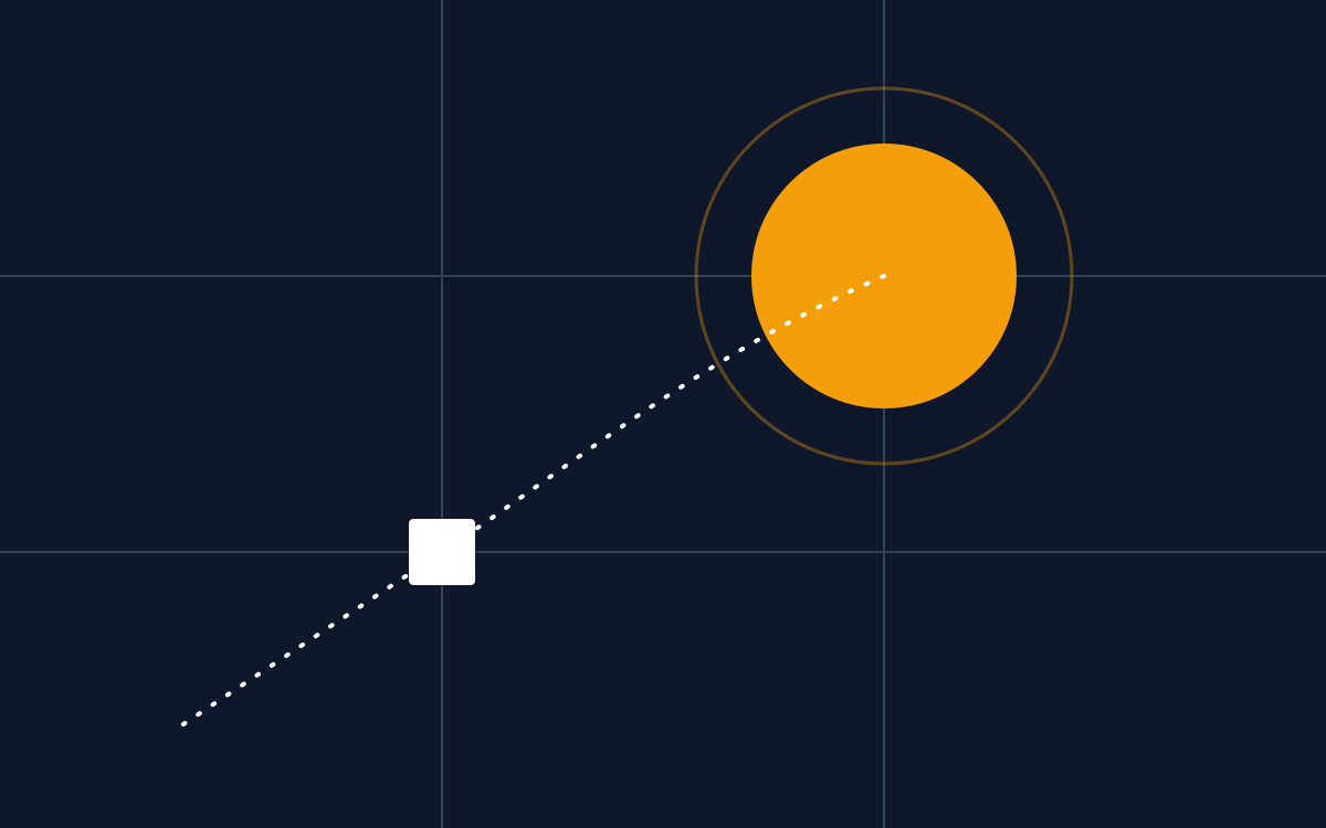
Change the numbers and watch how the same layout snaps to the grid. Twelve columns divide cleanly into halves, thirds and quarters, which is why most web frameworks use it.
Interactive grid builder: change columns, gutter and margin to see how a layout responds.
Responsive grids for the web
A website must work on screens from a large monitor down to a small phone. Responsive design handles this by changing the grid at different screen widths, called breakpoints.
As the number of columns drops, content that sat side by side on a desktop stacks vertically on a phone. When you design, decide the stacking order early. Usually the most important content, such as the headline and main call to action, should appear first on a phone. Margins and gutters also shrink on small screens so that content has enough room.
A spacing system: the 8-point scale
A grid controls where things go horizontally. A spacing scale controls the gaps between them vertically and inside components. Many designers use multiples of 8 (8, 16, 24, 32, 48, 64) because they divide easily and scale cleanly on screens.
The rule is simple: only use values from the scale. Small gaps go inside components, medium gaps between related groups, and large gaps between sections. When every gap comes from the same short list, your layouts look organized even before you add color or images. The same idea works for print: choose a base unit, such as 4 mm, and build your margins and gaps from multiples of it.
A five-step method for using a grid
- Decide the format and size of your design first.
- Set the margins and keep them equal unless you have a reason.
- Choose the number of columns and gutter size. In Photoshop use View > New Guide Layout. In Illustrator or InDesign use the layout or guide tools.
- Place the biggest elements first (images, headline), snapping to columns.
- Fill in supporting content, and check that edges line up.
Breaking the grid on purpose
Once your layout is working, one element that crosses a margin or spans an odd number of columns can create tension and draw attention. The key is that it should look deliberate. A single broken element in an otherwise orderly layout reads as a feature. Many broken elements read as a mistake.
Common grid mistakes
- Setting a grid but not snapping elements to it.
- Making margins different on each side by accident.
- Choosing a grid that is too complicated for the content.
- Forgetting gutters, so text blocks touch each other.
Grids work best together with generous space. Read why white space makes a design look more expensive next, and then try the grid in our flyer walkthrough.
Frequently asked questions
How many columns should a flyer grid have?
Two to four columns work well for most flyers. Use two for simple, bold layouts and three or four if you have several blocks of information that need to sit side by side.
What size should gutters be?
Gutters should be wide enough that neighboring columns of text clearly separate. On screens, 16 to 32 pixels is common. In print, 4 to 6 mm is a typical starting point for flyers and brochures.
Do grids make designs look boring?
Not when used well. A grid provides order, and you can create interest through scale, color, images and occasional deliberate breaks. Many dramatic poster designs are built on a strict grid underneath.
Can I use a grid in Canva?
Yes. Canva offers rulers, guides and layout grids, and you can create custom guides with margins and columns. The principles are the same as in Photoshop, Illustrator or InDesign.