Gradients That Look Modern, Not Cheap
Why some gradients turn muddy, five gradient recipes that look current, and where gradients work in a design.

6 min read

Gradients came back, and so did bad gradients. You have seen them: a rainbow behind a logo, a muddy brown band where blue meets orange, a button that looks like it was made in 2008. A good gradient feels like light. A bad one feels like an effect. The difference is not the software. It is which colors you pick, how far apart they are, and where you use the gradient.
Key takeaways
- Blend colors that sit close together on the color wheel for clean, modern gradients.
- Opposite colors (blue and orange, red and green) turn grey in the middle; add a middle stop to fix it.
- Use gradients on large backgrounds and shapes, not on small text or thin lines.
- Add a little noise or grain to stop banding on screens and in print.
Why some gradients look cheap
Most dated gradients share three problems: too many colors, colors that clash, and gradients on everything. When a design has a gradient on the background, the heading, the button and the border, nothing stands out and the whole thing looks like a template.
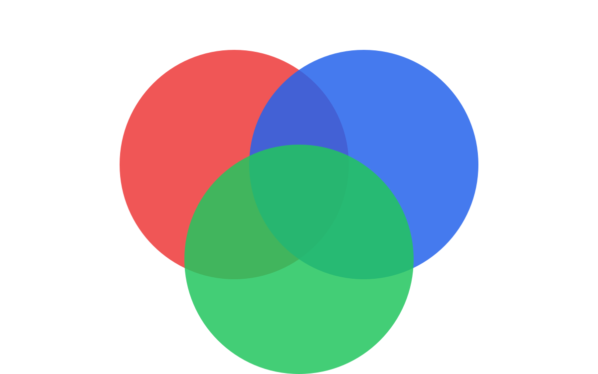
The figure shows the most common technical mistake. When you blend two colors that sit opposite each other on the wheel, the software mixes them in a straight line, and the midpoint lands near grey. That is the "muddy middle" that makes a gradient look dirty. See color theory for beginners for how the wheel works.
Five recipes that look current
| Recipe | How | Use it for |
|---|---|---|
| Analogous | Two or three hues next to each other: violet to pink, teal to blue | Backgrounds, hero sections, app screens |
| One hue, two depths | A light and a dark version of one color | Corporate brands, buttons, cards |
| Bridged complementary | Blue to orange with a magenta or warm pink stop in the middle | Bold posters and music flyers |
| Mesh or blur blobs | Soft colored shapes heavily blurred behind content | Modern tech and product ads |
| Light leak | A warm glow fading into a dark base | Product shots, food, night events |
How to build one, step by step
- Pick your brand's main color first. The gradient should feel like that color with light on it.
- Choose the second stop 30 to 60 degrees around the wheel, or a lighter or darker version of the same hue.
- If you must join opposite colors, add a middle stop that shares a little of both, and keep it bright.
- Make the transition long and gentle. Short, hard transitions look like stripes.
- Set the angle with intent: light usually comes from the top or top-left.
- Add 1 to 3 percent noise to hide banding, especially for print and dark gradients.
Where gradients work, and where they do not
- Good: large backgrounds, hero areas, abstract shapes, app splash screens, social post backgrounds.
- Careful: buttons. A very subtle top-to-bottom shift is fine; a rainbow is not.
- Avoid: body text, thin lines, small icons and logos that must also work in one color.
- Print: gradients can band. Ask the printer for a proof, and remember that bright screen colors may not exist in CMYK. See RGB vs CMYK.
Frequently asked questions
How many colors should a gradient have?
Two is enough for most work. Three when you need to bridge opposite colors. More than three usually looks like a rainbow effect.
Why does my gradient show stripes?
That is banding. It happens with 8-bit color and long, subtle transitions. Add a little noise, work in 16-bit if your software allows, and export at high quality.
Are gradients still in fashion?
Yes, but the current style is soft and light-like rather than shiny. Think glows, mesh blurs and gentle two-tone backgrounds.