How to Build a Brand Color Palette in 30 Minutes
A step-by-step method for building a brand color palette with the 60-30-10 rule, including how to pick neutrals, an accent and accessible text colors.

7 min read
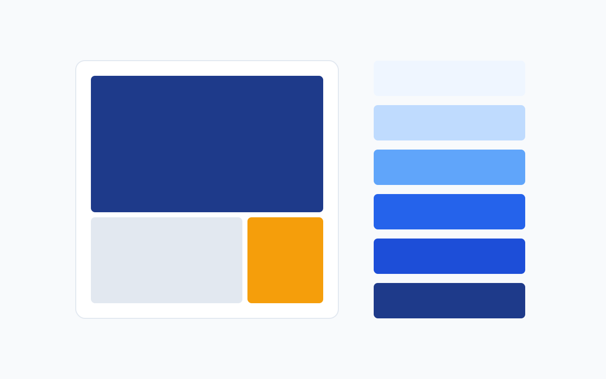
A brand color palette is the small, fixed set of colors a brand uses everywhere: logo, website, social posts, packaging and print. A good palette makes everything you design look like it belongs together. A bad one, or no palette at all, makes a business look inconsistent. The method below takes about thirty minutes and works for a personal brand, a client logo or a side project.
Key takeaways
- Use one primary color, one accent and a set of neutrals. That is a complete palette.
- Apply the 60-30-10 rule to decide how much of each color appears.
- Create tints and shades of your primary instead of adding new hues.
- Test every text and background pair for contrast before you finalize.
Step 1: Define the brand in three words (5 minutes)
Before touching a color picker, write three words that describe how the brand should feel, for example "trustworthy, modern, warm". Those words guide every later decision. If you are working for a client, ask who the audience is and what competitors look like. Avoid copying competitor colors exactly, but note the conventions of the industry so you know when you are following or breaking them on purpose.
Step 2: Choose the primary color (5 minutes)
The primary color is the one people should remember. Choose it to match your three words. If you need ideas, read our guide to color psychology in branding. Pick a hue, then adjust saturation and lightness until it looks confident on a white background. Avoid extremely bright, fully saturated values for large areas; slightly deeper tones usually look more professional.
Step 3: Add an accent (5 minutes)
The accent is your attention color. It should be used rarely, on buttons, key numbers, highlights and links, so it always stands out. A reliable way to pick one is to use the color opposite your primary on the wheel (a complementary accent), or a neighboring hue for a softer feel. See color theory for beginners if you need a refresher on harmonies.
Step 4: Build neutrals (5 minutes)
Neutrals do most of the work in a layout. You usually need a near-white background, a light gray for dividers and cards, and a near-black for text. Instead of pure black (#000000), choose a very dark version of your primary hue, such as a deep navy. It feels more refined and ties the text to the brand.
Step 5: Apply the 60-30-10 rule (5 minutes)
Interior designers use this rule and it works for graphics too. About 60 percent of the design should be your dominant color, usually a neutral. About 30 percent is your secondary or main brand color. The last 10 percent is the accent. The proportions are a guide rather than a law, but they stop the most common palette problem: giving every color equal weight.
Step 6: Create tints and shades (3 minutes)
You do not need ten different hues. Take your primary and make lighter versions (tints) and darker versions (shades) by changing only lightness. These give you backgrounds for cards, hover states and chart colors without leaving the brand.
Step 7: Test contrast and save the palette (2 minutes)
For every pair you will actually use (for example white text on your primary), check the contrast ratio. A ratio of at least 4.5:1 is the standard target for body text. Large headings can go a little lower. Fix failing pairs by darkening the background or choosing a different text color. Finally, write the palette down with HEX values (for screens) and, if the brand will be printed, the closest CMYK or Pantone equivalents. Our guide to RGB, CMYK and Pantone explains why those differ.
Use this checker on every text and background pair in your palette before you hand it over. Try the yellow presets to see why bright colors so often fail.
Interactive contrast checker: choose a text color and a background color to see the WCAG contrast ratio.
Worked example: a palette for a juice bar
To see the whole method in action, imagine a fictional client called Sunrise Juice, a small cold-pressed juice bar. The owner describes the brand as fresh, natural and cheerful.
- Primary: a deep leaf green (#166534). Green signals freshness and nature, and a deep shade feels more established than a bright lime.
- Accent: a mango amber (#F59E0B). It is warm, appetizing and nearly opposite green in temperature, so it pops.
- Background: a warm cream (#FFFBEB) instead of plain white.
- Ink: a warm near-black (#1C1917) for text.
- Support: a pale lime (#D9F99D) for small highlights and illustrations.
Now the contrast test, which immediately changes one decision:
White text on the amber accent fails. Rather than abandoning the accent, the rule becomes: amber buttons always use dark ink text. That single rule, written into the palette document, prevents a readability problem on every future design.
Test the palette on real layouts
A palette that looks good as five squares can still fail on real work. Before you hand it over, apply it to at least three formats the brand will actually use.
As you test, ask three questions. Does the brand feel the same in every format? Is the accent still rare enough to stand out? Can every piece of text be read comfortably? If the answer to any question is no, adjust the palette now. It is much cheaper to change a hex code today than to reprint signage next year.
Palettes for dark backgrounds
Many brands need to work on dark backgrounds too: night-time event flyers, dark mode apps or a black shop sign. Do not simply invert the colors. Instead, choose a dark neutral (often a deep shade of the primary), use a lighter tint of the primary for headings and keep the accent as it is if it passes contrast. Test the logo on the dark background as well, and add a reversed version to the brand files.
What to include in your palette document
| Item | Example |
|---|---|
| Color name and role | Primary Blue |
| HEX (screen) | #2563EB |
| RGB | 37, 99, 235 |
| CMYK (print starting point) | Convert, then proof on paper |
| Usage note | Logo, headings and buttons only |
| Do not | Place on dark navy without a white outline |
Common palette mistakes
- Choosing five or six bright colors with no neutrals.
- Using the accent color everywhere, which removes its power.
- Never testing the palette on real layouts such as a social post, a flyer and a website header.
- Forgetting a dark-background version of the logo colors.
Once your palette is ready, test it on a real project. A good next step is designing a flyer from scratch using only your new colors.
Frequently asked questions
How many colors should a brand palette have?
Most brands work well with one primary color, one accent and three or four neutrals. Large brands sometimes add secondary colors for categories or campaigns, but they still keep one primary color as the core of their identity.
Should my brand color be unique?
It should be distinctive within your market rather than unique in the world. If every competitor uses blue, a well-chosen green or orange can help you stand out. If you choose the same color as competitors, you will need stronger typography and imagery to be recognized.
What is the difference between HEX, RGB and CMYK values?
HEX and RGB describe screen colors. CMYK describes ink mixes for print. A brand palette document should list both, because a color converted automatically from screen to print can shift. Read our guide to RGB, CMYK and Pantone for details.
Can I change my brand colors later?
Yes, but plan it. Changing colors means updating the logo files, website, social templates, signage and printed stock. Many brands refine their palette slightly over time instead of replacing it completely.